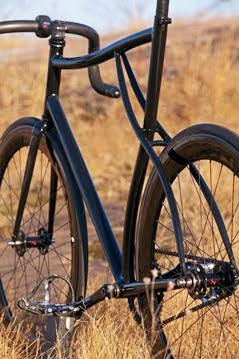
Hope you mofoz dig it! Not that I really care one way or another- no seriously! Let me know what you guys think and send me some fresh links to update my blog roll etc. But yeah, it's been a looooong ass time coming. I don't know about you guys but I've been SO super sick of looking at that last header photo already! For like a two something years. Dumbass..
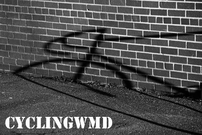
For once I picked a non fiery photo. Which I wasn't really sure about at first but eventually decided it was a rad photo so why the fuck not. I kinda dig the way the bike's shadow is askew against the rigid brick wall. I could sit here and read into it but I'll spare you of the typical artsy nonsense and let you enjoy the image for what it is. Rad..
For once I picked a non fiery photo. Which I wasn't really sure about at first but eventually decided it was a rad photo so why the fuck not. I kinda dig the way the bike's shadow is askew against the rigid brick wall. I could sit here and read into it but I'll spare you of the typical artsy nonsense and let you enjoy the image for what it is. Rad..
Anyways, just wanted to continue to change things up a bit. I might make a few more tweaks along the way but I'm pretty cool with it for now. More soon!


3 comments:
The monochrome looks good and the tone is more professional. Both changes in the right direction if you ask me! Our blog looks hokey and I've been just as lazy as you were!
Thanks man! I think my main problem was that I just over thought it. Which only fed into my laziness. Stoked I finally just did it tho! It was just so tired looking. You guys should give it a try too :)
looks rad.
Post a Comment